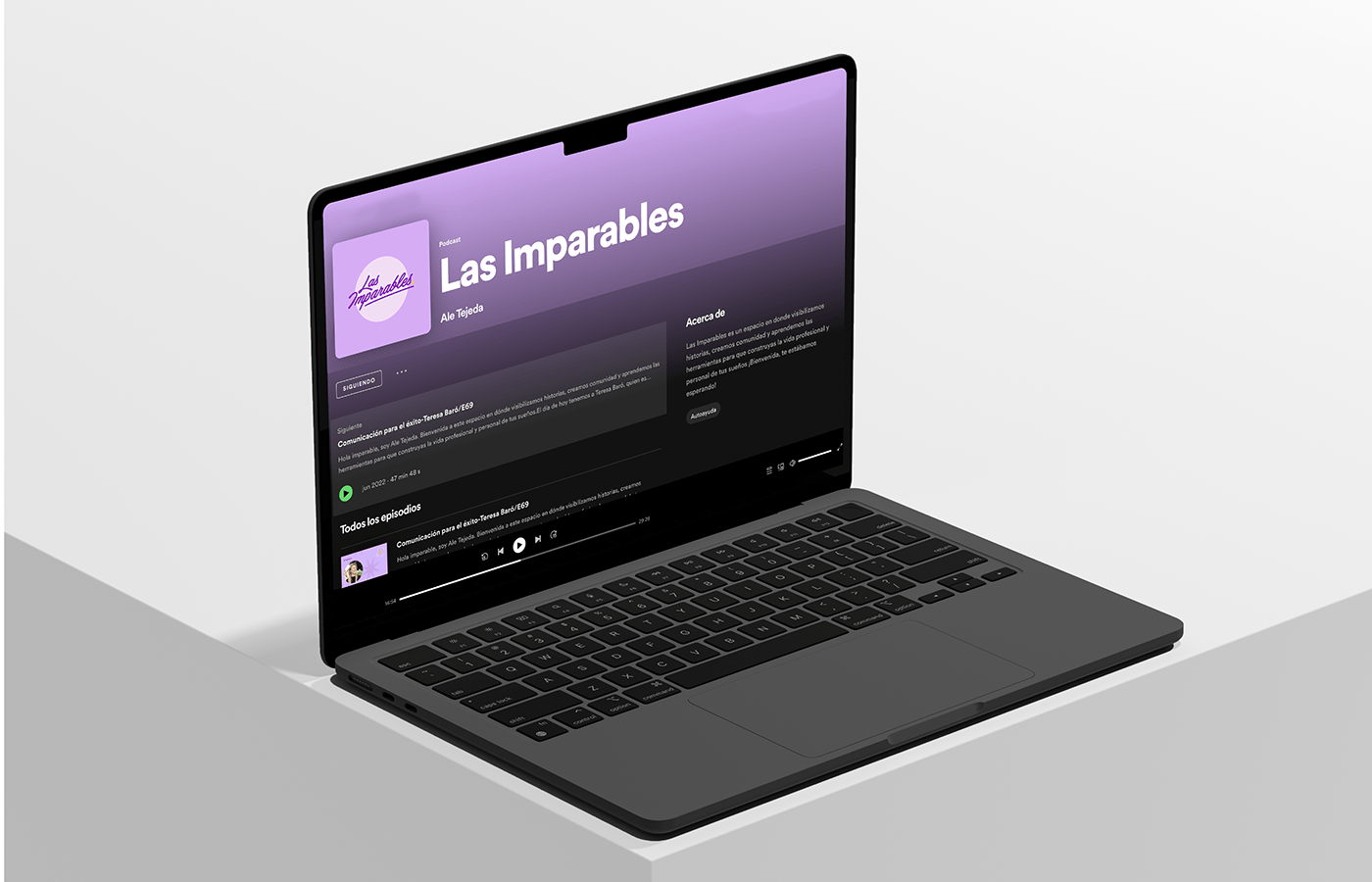
Las Imparables
Brand Identity
We present our exciting collaboration to develop a brand that represents the community and women's professional and personal growth. Our main objective was to create a strong and dynamic image that inspires empowerment and strength in each of the women who are part of this incredible community.
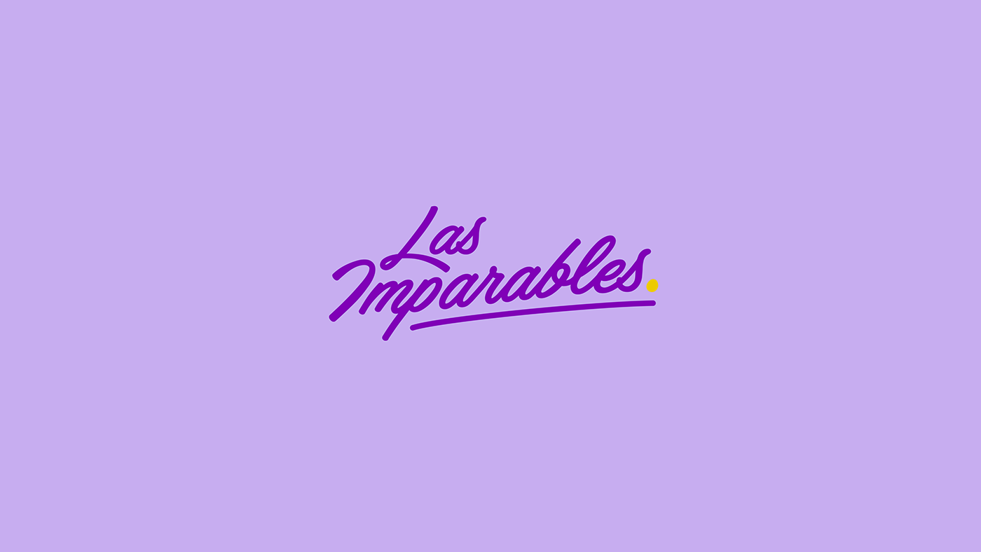
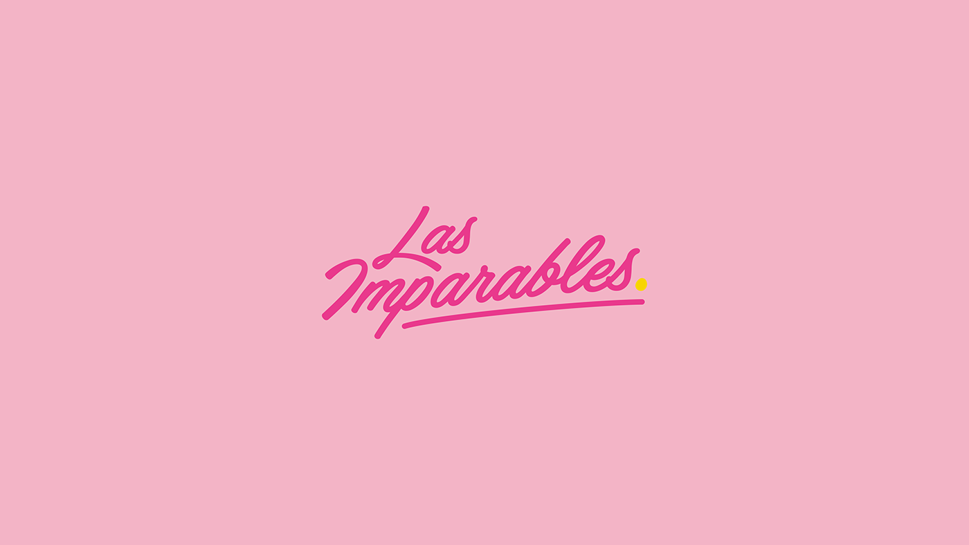
We set out to capture the essence of the female community and convey its transformative power. To achieve this, we created a distinctive brand that combines elements symbolizing unity and progress. Its curved and dynamic lines symbolize movement and constant growth.
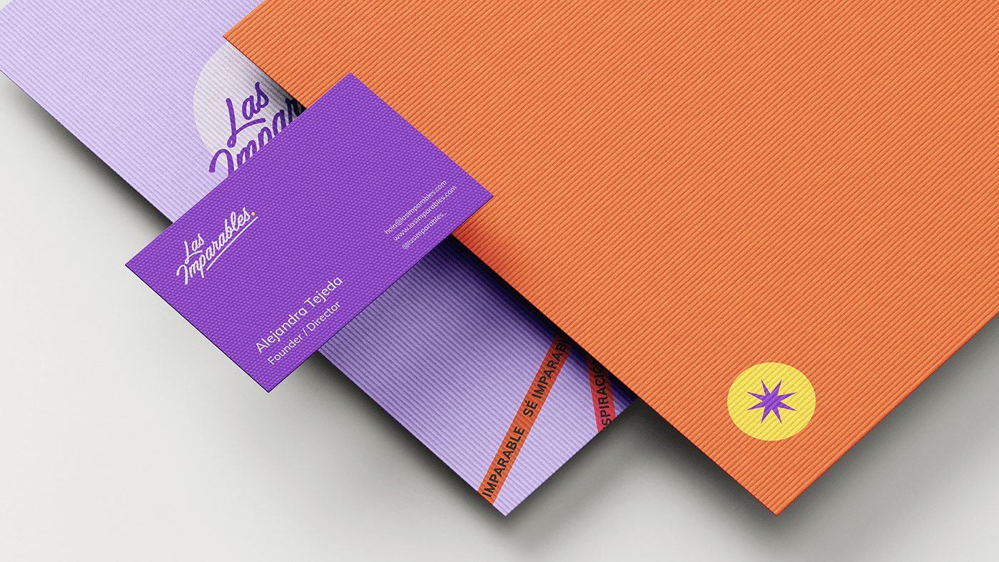
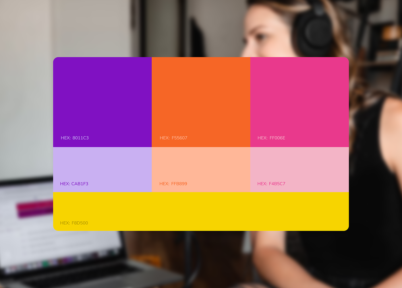
The carefully selected color palette further reinforces the message of empowerment. Vibrant and energetic tones intertwine with softer shades, creating a balance between strength and serenity. This contrast of colors reflects the diversity and versatility of the women who are part of this community, each with her own path to success. Every design element has been carefully attended to, ensuring visual coherence and a strong identity in all aspects of the brand.
Location: Jalisco, Mexico
Client: Las Imparables